Reply With Quote
I wonder if, in the post season appraisal, they realised this was the real reason for our relegation.Originally Posted by Rjk

https://www.readingfc.co.uk/news/202...he-biscuitmen/
Reading's kit is modelled on a biscuit tin.
| + Visit Cardiff FC for Latest News, Transfer Gossip, Fixtures and Match Results |


hopefully not the grey away kit though
I wonder if, in the post season appraisal, they realised this was the real reason for our relegation.
https://www.readingfc.co.uk/news/202...he-biscuitmen/
Reading's kit is modelled on a biscuit tin.

looks like a lot of puma which i dont mind at all...
but yeah thet reading kit lol, i swear i got a table cloth here just like it

What is it with Reading doing the most outlandish kits?
Port Vale look like they've come out of the 1800's. Doncaster's kit looks nice though. And Posh's kit is beautiful to me.

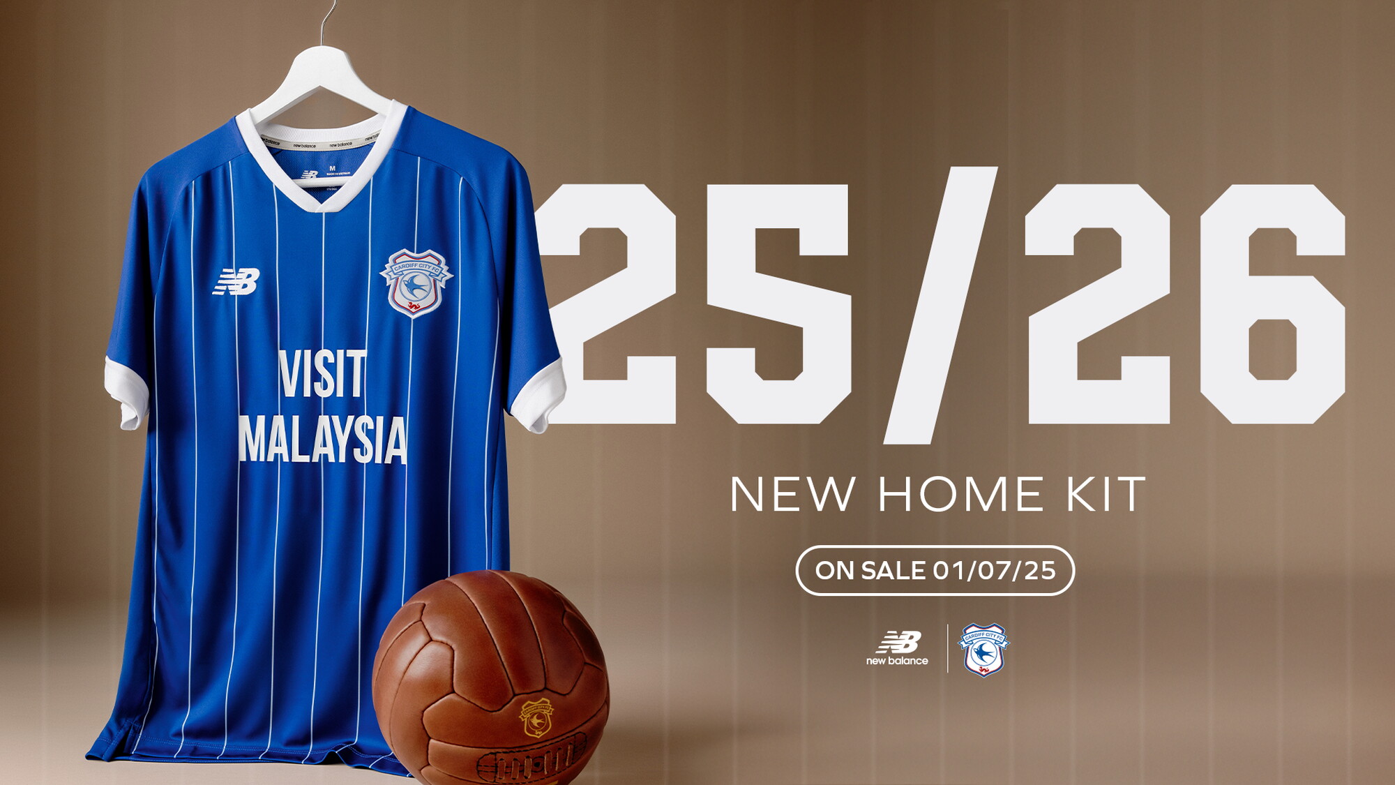
Any ideas when ours will be out?

The day before our first game! Tan doesn’t want to reveal the return to Red too soon!
Thats a shame. I guarantee most fans prefer last years. Cant have the fans happy now can we lads.
Yeah that can get in the bin

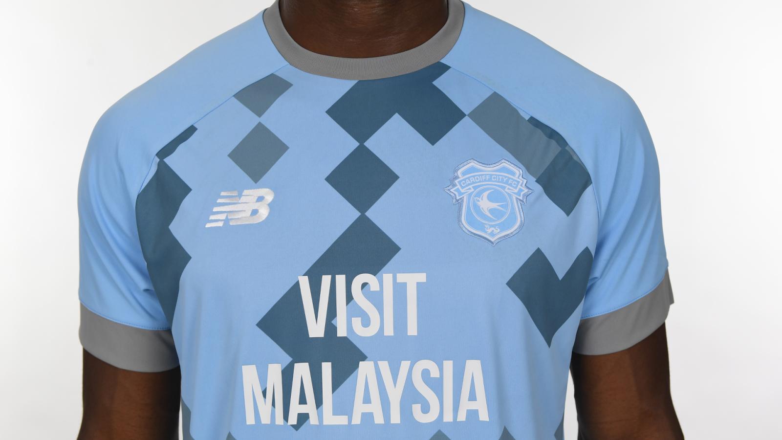
I like the grey away kit.
One of our best.
I dont care if Im in a minority of one (Im not) - it is important to stand up for principles, sartorial excellence and contrariness whenever possible, no matter the size of the pile on from the Boards fashion correspondents!
Grey rules!
I wouldn't mind wearing it, I ha e plenty of other clothes that are in a similar shade.
just whenever I saw the team lining up in it I had a sense of foreboding

The club need to appoint someone whith half an ounce of style/colour sense before accepting new kits.
Whoever decides now has been conned by various snake oil salesman selling them disgusting colours and designs with bullshit descriptions in recent seasons.
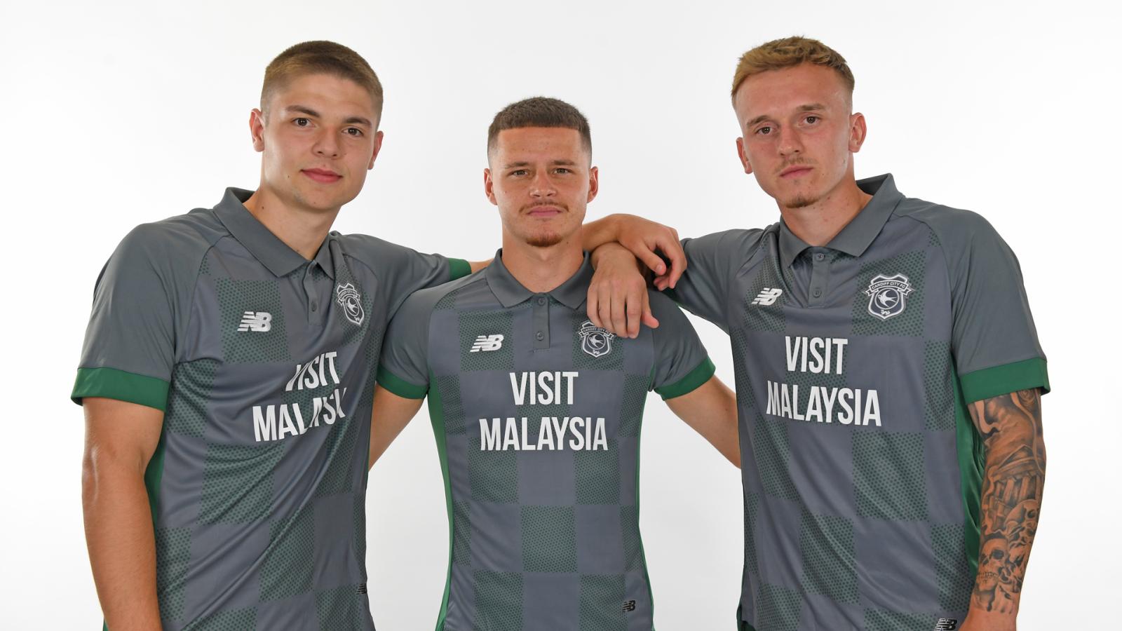
'The away shirt pays tribute to Cardiff’s coal mining heritage within Cardiff and the valleys' FFS what a crock of shite we were sold last year
'The Third kit features various shades of marine blue, signifying the waters of Tiger Bay - the City's historic hub of trade and industry - as well as Cardiff Bay, the modern bastion of Welsh politics, culture and arts'
Ban him Mike
Also, and I say this every year - Please can we have black away kit with yellow trim. We've missed the adidas years when it would have looked incredible but we can still get a half decent one. Say it's a tribute to the coal mines and the canaries if you have to, just give us it
Mike the kits were fine.
AFC Wimbledon

Cardiff City
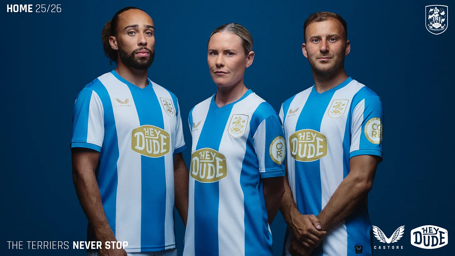
Huddersfield Town

Is that the vegan brekkie?
Exeter City

In the pre advert they’ve used a sky blue shirt icon. A clue or a mislead?
Oh!
Kin

It's amazing to me how many fashion experts there are on this Board whereas our fans in general including me are hardly a shining example of sartorial elegance. I wonder if fans take as much time on worrying about their own attire as they do commenting on our new football kit.

Good lord, man, most of us are sat around in our hovels wearing only a fried egg-stained string vest and off-white droopy y-fronts that haven't seen a washing machine since 1986. Our receding hair and month-old stubble is matted with Brylcreem and food detritus, our toes are separated with toe-jam and our cribs reek of cat's urine, sweat and talcum powder. We are covered in flies and the carpets stick to our rancid slippers as we pop to the kitchen sink for a pee or head for the front doot for the next pizza delivery. We are 8 stone overweight, covered in bed sores and fecal matter pebble-dashes the walls like a Jackson Pollock painting.
However, we reserve the right to highlight any perceived minor aesthetic imperfections in others.

Plymouth is nice. Port Vale is Glorious. Huddersfield would be great if it wasn't for that ridiculous sponsor. What a shame.
 Posting Permissions