
 Reply With Quote
Someone will still moan there's no white socks.🤣
| + Visit Cardiff FC for Latest News, Transfer Gossip, Fixtures and Match Results |


Inspired by our past. ��
— Cardiff City FC (@CardiffCityFC) June 25, 2024
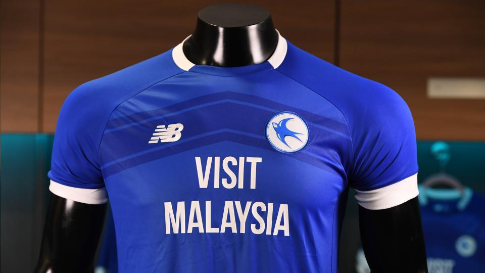
Introducing the 2024/25 #CardiffCity home kit. ��#CityAsOne | @NBFootball pic.twitter.com/qPNPWFIjlf

Someone will still moan there's no white socks.🤣
LOVE IT!

available to buy 9am this Saturday
https://www.cardiffcityfc.co.uk/news/202425-home-kit
Like it. My favourite badge.

Like the collar, love the badge. Best kit we've had for a while imo
Bulut wearing a Prada two piece to training yesterday, now this kit, fashionista's of the Championship.
Happy with that. It really does show how bad the badge with the red worm is.
Very nice.
I'm not a fan personally however good to see the general consensus positive
Lovely shirt, just hope they got my belly size!!
Great kit!
Pity about the sponsorship.
Great "retro" look to it.
Will they be selling at retro prices?
Probably not.
Originally Posted by bobh

Exactly what I was going to say. Nice kit by modern standards, good to see the red ragworm removed from the badge, shame about the logo on the front.

Like it, especially the badge.
Wonder if that's the last we've seen of Tan's dragon or whether it'll make a comeback next year.
Be nice to have a yellow away shirt with the similar design


Awesome. Can see that shirt flying off the shelves. Hopefully some decent training clobber to go on sale with it this season also.
Being devils advocate not as bad as the beer mat badge
Looks like it is still on the coaches and training gear from the pics released yesterday 👍
I'm older than ten, so I'm not as excited as some, but it does look quite nice

from a purely aesthetic point of view the 'NB' logo, the sponsor and the circular badge are all crammed in too close together, with the circular badge closer to the sponsor than the 'NB' logo..
that being said the circular 'bluebird' badge is a welcome change from the red bordered crest with the red ragworm on the bottom, a definite improvement..
regardless, I don't buy replica kits anymore so this is not an issue for me, for those that do have at it..

I wouldn’t mind those shorts, but in a cotton/dress shorts type of fashion with pockets. Would be decent to wear on nice days or on holiday etc.

Not that I buy them anymore but I think it’s one of the best we have had for some time. Very pleased.
They're also not centred in relation to the lines on the chevron. Once you see it you can't unsee it!
I think a cotton dress would be a bold statement, but you go for it
 Posting Permissions
