+ Visit Cardiff FC for Latest News, Transfer Gossip, Fixtures and Match Results
Page 1 of 3 123 LastLast
Results 1 to 25 of 51

Thread: Away Kit

  1. #1
    International jon1959's Avatar
    Join Date
    Jan 2007
    Location
    Sheffield - out of Roath
    Posts
    17,897

    Away Kit

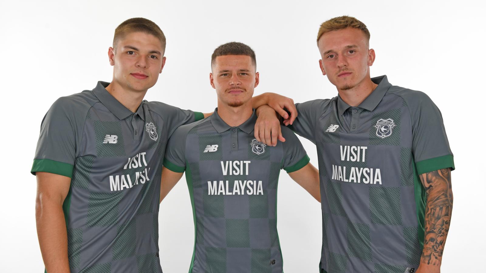
    So only the home kit gets the new/old badge.

    The worm is back on the club badge (in white) for the away kit - a collared grey/green number!


    https://www.cardiffcityfc.co.uk/news...-city-away-kit

  2. #2

    Re: Away Kit

    Not fussed on that, shit collar shit badge

  3. #3

    Re: Away Kit

    not a fan of this one

  4. #4

    Re: Away Kit

    A missed opportunity I think.

    Whilst the chevron on the home kit, and the checks on this, are a welcome nod to the past, this would have been much better in amber and chocolate. Not surprised about the badge.

  5. #5

    Re: Away Kit

    Quote Originally Posted by jon1959 View Post
    So only the home kit gets the new/old badge.

    The worm is back on the club badge (in white) for the away kit - a collared grey/green number!


    https://www.cardiffcityfc.co.uk/news...-city-away-kit
    If we tolerate this , then your colour will be next .....

  6. #6

    Re: Away Kit

    Should be easy to pick out a team mate on a cold, dark night in February. Yes, there's floodlights up would much prefer a colour that stands out. And, the worm is back.

  7. #7

    Re: Away Kit

    It's genuinely hideous.

    Color , collar , design. Just horrible.

  8. #8

    Re: Away Kit

    Not great is it?

    Why only have the bluebird badge on the home kit? Doesn't make sense

  9. #9

    Re: Away Kit

    Quote Originally Posted by City123 View Post
    Not great is it?

    Why only have the bluebird badge on the home kit? Doesn't make sense
    Doesn't make sense you say?

    Tan, City and kits?

    Hmmmm...

  10. #10

    Re: Away Kit

    That is an #epicfail design.....bargain bucket shirt and we're only pre-season.

  11. #11

    Re: Away Kit

    Looks like a training shirt.
    Not very impressed... But the player in the shirt is more important

  12. #12

    Re: Away Kit

    Quote Originally Posted by Hilts View Post
    It's genuinely hideous.

    Color , collar , design. Just horrible.
    Be better in a bright colour

    Say red ?

  13. #13

    Re: Away Kit

    Dull, but at least it will match the football we play

  14. #14

    Re: Away Kit

    Looks like something you'd wear working in the warehouse at Screwfix or some such. It's meant to be charcoal for the mining apparently but that's not charcoal. Poor.

  15. #15

    Re: Away Kit

    I think it's OK. Yeah yellow would have been better than green, but we've had worst!

  16. #16

    Re: Away Kit

    Quote Originally Posted by Jimmy the Jock View Post
    Be better in a bright colour

    Say red ?
    I like grey.


  17. #17

    Re: Away Kit

    Fair play, that is hideous.

  18. #18

    Re: Away Kit

    Quote Originally Posted by Jordi Cul View Post
    Doesn't make sense you say?

    Tan, City and kits?

    Hmmmm...
    Isn't he against yellow in our kits because it's bad luck?

  19. #19
    International jon1959's Avatar
    Join Date
    Jan 2007
    Location
    Sheffield - out of Roath
    Posts
    17,897

    Re: Away Kit

    I like it

    However, as Armitage Shanks says, it looks more like a training (or leisure) top.

    I would have preferred the home kit badge, and not convinced by the collar, but otherwise OK. I like the '125' on the back.

  20. #20

    Re: Away Kit

    If it's a tribute to mining then have Feck Thatcher embedded in the shirt instead of the bluebird which is on the blue one.

    Ditch the hideous collar then I'd think of getting one for a tenner in a sale next summer.

    Seriously who designs and approves shit like this top.?

  21. #21

    Re: Away Kit

    Quote Originally Posted by Jimmy the Jock View Post
    Be better in a bright colour

    Say red ?
    Even though it would be unpopular with some I actually think we'd sell far more red tops with a decent design than this so called mining appreciation top.

  22. #22

    Re: Away Kit

    It’s fine as a normal away kit… they had the chance to do something special, most I’ve spoke to wanted the black and yellow kit or a revamped version. Two different badges for the season is odd. Epic fail.

  23. #23

    Re: Away Kit

    Doesn't really look like a football shirt.

  24. #24

    Re: Away Kit

    Why don’t they listen to the fans (or customers in the case). Riverside or Black/Yellow would have sold, this is just a dull grey polo. Not much of a celebration. Missed opportunity to sell something that people would want.

  25. #25

    Re: Away Kit

    Absolute dog shit. And a white bird again. WTF?

Posting Permissions

  • You may not post new threads
  • You may not post replies
  • You may not post attachments
  • You may not edit your posts
  •